Thursday, August 07, 2008

CASINO HOTEL CONCEPTS


Recently, I came across these images I did for an Architectural Firm, where I had to concept the following images for an upcoming meeting with several big investors looking to build hotels in Las Vegas.
The idea was to design these hotels to look like they were "Space Ships", on the ground, waiting for take-off!!


Here are several details of the final Acrylic renderings, which were done at approx 30X40 inches in size. These images were rear projected in their final form as a total panorama effect, in the room in which the meeting took place.


This final image shows yet another concept idea of a different style of "Space Ship" design that looks as if it was buried into the landscape it landed in. Overall, this
project turned out to be quite a bit of fun for both myself and the Creative Director from the clients' firm. Hope you enjoy seeing these images.

Robot Experiment

This post consists of two quick Photoshop experiments I did recently with a ROBOT theme in mind.
Mostly, I waS JUST PLAYING AROUND WITH FILL COLOR AND BACKGROUND TEXTURES.
I HIGHLY RECOMMEND THAT ANY ENTRY LEVEL ARTIST make it a practice to keep up to date with any and all new digital technology available. You only learn by "DOING"!!


I'll be posting more experiments soon on my Blog. School starts on August 25th, so I will be busy from that point on, for the Fall semester. Be back soon....

Monday, July 14, 2008

My Trip To Michigan over the 4th of July

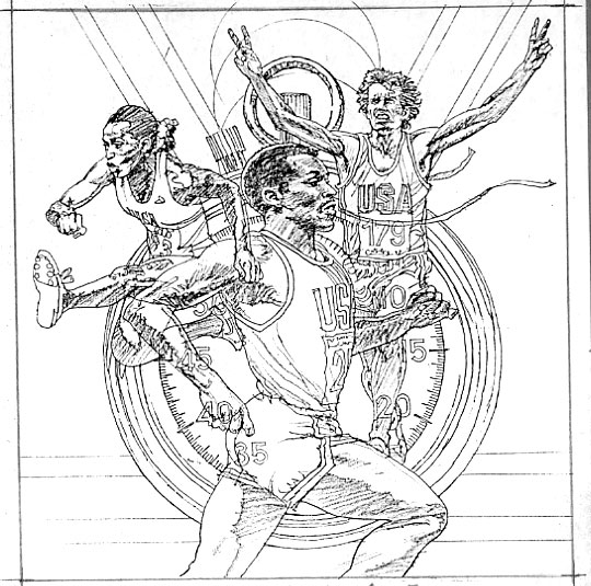
I went to Michigan (Lakeville/Oxford) over the July 4th Holiday, to celebrate my granddaughter's birthday, and also visit
with my son, daughter-in-law, and my other grandchild, Braden.
She's a Firecracker baby, born on the 4th of July! My son and his family, live right on the lake, with a boat, and dock, so the trip was one that I looked forward to.
I planned to keep a journal, for the entire length of my stay, and have my granddaughter work with me in filling it up
with our daily events. Jacqueline began the book with this cover design, and I'll post as many of the spreads as I have photos of before I had to return home.


Here are the first few spreads by Jacqueline, without any of "Pa Pa's" help.


We worked on the following spreads, on a daily basis. After breakfast, we normally had a chance to sit at the dining room table and talk about each entry, and what we would put on each page.


Since friday, the 4th, was jacquelins' actual Birthday, we held a little pre-party that morning, where she was showered with all kinds of bagged gifts from various family members. She was obviously levitating in her chair, as each gift was opened.

The gardners' came that morning to finish the trimming, and mulching around the outside patio and deck area, and then we made a last minute trip to the Meijers' Store to pick up the cake, and other goodies. All these events are reflected in
the following spreads.


Little, by little, we filled up each spread with images that we thought would record the previous days' events, that
lead to her Birthday party, on Saturday, July 5th, at the lake house. It was a fun time, and a big successful turnout of many
of Jacqueline's school friends. Her brother, Braden, who is three years old, also had a GREAT time at the party!!


I will be getting the final few spreads from jacqueline soon, and plan to add them as a follow-up Posting, so the whole
journal will be complete on my Blog.
That's all for now. I'll be back in a short time with the additional artwork.

Saturday, June 07, 2008

Preliminary Drawings for Three new figure concepts

Now , that my Summer school session has been completed, I hope to move forward with these three figure concepts.
I've finished the pencils on these pieces, and have them on board, ready to go. I haven't worked on any nude figure studies
for some time, so I'm looking forward to having some fun with these. They're fairly large sized boards, so.... if they go well,
I might be able to sell them near the end of summer.


I really am taken with the style of Ashley Woods' recent work. You may be familiar with his "POBOT" series (trade mags),or his "Tank Girl" graphic novels. Very limited palletes, and loosely rendered. I will let his work mentor to me, and we'll see
where it takes me. Here are the three final drawings, on the board, waiting for me to begin.....


i will be adding a lot more posts, as the summer unfolds. I will try to finish these three pieces, and publish the results near the end of this summer. There will be other items, and visuals I plan to place here , long before I finish the three nude series.

Recent Images from Fantasy Sketch Group

It's been some time since my last posting. The reason being: finishing up with teaching Illustration courses for the
Spring semester, various projects in the studio that has kept me extremely busy, when I'm not teaching, and finally
the many commitments I have as Chair of the Illustration Section at the St Louis Artists' Guild.

That being said, lets move on to the Fantasy Sketch Group. What a fun, and much needed, (for me) monthly, get together,
group of friends, and fellow artists. We draw for three hours, from live models (sometimes two at a time), for ten minute sessions. It's agreat opportunity to try new tools, visual approaches, and visual concepts that are for me and my own
amusement. Plus, I use the time to learn some new drawing skills.

I will post several examples today of a fairly recent session, in which I wanted to draw, using only colored Pentel pens, with
just a hint of some additional marker, here and there. Check out the following..............


Sometimes, I will take what I've done during a group session, and scan the art into photoshop, or Painter, and then add some digital color as an experiment. You can see how this works in the following two examples.......


Friday, October 26, 2007

THURSDAY DEMO / DRACULA

A lot of time has gone by since my last posting. I recently did a DEMO at the St louis Artists' Guild, in St. Louis.
Since Halloween is approaching, i thought it would be appropriate to do a RUB-OUT painting technique, using
Count dracula as my model.
The following pics are of my preliminary drawings. color sketches, and finally, the finished demo.


These are the pencils I used to create the final demo. The first image is a detail of the head portion of the full upper body
sketch. I only used the head as my subject for the demo.
I made a zerox copy of this sketch to about 14 inches in height. I then pasted it onto a canvas board, using Acrylic
Gel right out of the jar. I applied a heavy coat onto the canvas board, and while that was still wet, I placed the zerox
on top of the wet gel, gently pressing it down onto the canvas board surface. After it was securely in place, I applied
another heavy coat of Acrylic Gel on top of the Zerox. This was set aside and allowed to dry, completely, before beginning the demo.


This color sketch was done, using some prismacolor pencils, on a copy of the drawing that had been taken to a full tone rendering. i wanted to use a red / green palette for the demo, so as to keep the painting to a limited palette.
After two hours (approx) of pushing around the opaque water color medium (gouache) on the Acrylic Gelled surface,
i finished the demo of Dracula's head. Here are the results:


Here is the full version of the final demo....


...and here is a detail of the head portion of the final art. Let me know what you think, and I'll return your comments.
Bill Vann

Tuesday, July 10, 2007

The Journey of the Ant

Last month I had the opportunity to create an Image that will become the visual portion of the label that will be applied to an Insect repellent used to control the local Ant population. The idea was to create an image of a single ant that looked a little scary, but wasn't in the Monster Horror movie imagery. The first stage was rough pencils, shown below.


One of the three ideas was selected, and a final pencil was scanned and emailed for approval....


The next step was to create a full color rendering, which I did using traditional tools and water based mediums on a watercolor board surface. The original artwork was approximately 9 X 12 inches. I made a quick trip to the clients office and delivered the end product.


Apparently, what i didn't know was that the line of products that this client manufactured had a very specific "DIGITAL"
style to all of their Illustrations. Of course, my traditional look stood out in contrast to what was being done by other artists.
Soooooo.... the next phase was to go back to the studio and crank up the "ol computer, and see what I could do to tweek the ant artwork, and make it look like it belonged to the other digital style that was on the product line.
Without having to start over, I scanned my image, took it into Photoshop, and after some serious layering and some slick blending and editing the final result, below, is what was then re-delivered to the client with happy results. Check it out!

Martin Luther King Art

It's been a while since I've been able to focus on posting new info and images on my Blog. Due to finalizing the last few weeks of the spring semester, and gearing up for summer school, plus whatever work has come my way in May and June, I just haven't found the time to do any posting.Here is an image that I did recently to honor the Reverend Dr. Martin luthert King Jr.on
the anniversary of his birth date.

The original image, shown here was done in color, and then had to be scanned, and converted to ablack and white image to be published in the St Louis Post-Dispatch newspaper. Here is the same image as it appeared in the Post-dispatch article. Dan Martin was the Art Director on this project. He's a long time friend and fellow Illustrator. A fast turn around, but that's normal for the Newspaper industry.

Saturday, March 03, 2007

Portrait Samples...an Overview

It has been some time since I've posted anything on my Blog, and I'm glad to be getting back to it!!
I've picked out a number of Portraits that I've created over a long period of time, and thought it would be good to post them and throw them open to comments. So... look these over, check out the mediums used, and get back to me with questions, or comments.
I'll start out with this Terry Bradshaw piece done originally for Conoco Oil and used for the NFL Hall of Fame Induction piece for his Induction into same. It was done using Acryla Gouache, on a gessoed board. Size was approx 28"X36".


Being in the arena of great sport athletes, the next image is of Jerry Rice in his heyday with San Francisco 49ers'. This was a cover for Chelsea House Pub. Medium used was gouache on acrylic geled board. Size: 12"X18".


Walter Peyton, or "Sweetness", as he was referred to in Chicago, by his fans, was a Sports Impressions Collectible Plate project
that was also created with Acryla Gouache on Cold Pressed Illustration Board. This piece was good sized at 20"X30".


Continuing with the athlete theme, and also created for Sports Impressions, is Michael Jordan for the avid plate collector.
This particular product literally "blew off the shelves"! Also painted using Acryla Gouache on Cold pressed board, and is
around 18" in height.


I did this next piece as a demo for the Dynamic Graphics Educational foundation. I worked for their Seminar division for
many years, as one of their Faculty. This image is of Doug Ross, who was an Attendee at several of my seminars, and who
has become one of my dear friends since i did this demo painting of him at DGEF. Gouache on gessoed board, 16X20".


Another cover for Chelsea House Pub, this montague of several Golfing Greats was a real fun piece for me to create for them.
Gouache on gessoed panel, at 16X20".


I'm going to wrap it up today with portraits of Pavoratti, Dr Martin Luther King, and two versions of Mark Twain. Here are those images, and the mediums used were pretty much the same as most of those other pieces pictured above.
Let me know what you think, and if you have any questions. Until the next Posting...


Friday, November 10, 2006

RUN FOR FUN POSTER PROJECT

Todays' posting will deal with the process steps I went through in the creation of an Illustration that eventually was used as a Ltd Ed Litho Print for an annual Running Event in the township of Webster Groves, Missouri.
I was asked to portray the three athletes who were helping to sponsor this event. They were Jackie Joyner Kershee, Craig Virgin, and Ivory Crockett. Each of these talented athletes are world record holders in their own specialty disciplines. The plus side of this project was that I got to meet and have lunch with all of them. A real special experience!!


My typical "first steps" are to doodle around with several very loose, and rather abstract visuals that are rumbling around in my head, as I weigh the direction and approach needed to satisfy the demand of the project.


Once a final visual direction starts working for me, I focus on that particular chosen sketch, and delete all other concepts. Then, I proceed to do a preliminary rough pencil, for client approval. If all goes well, I execute the final sketch to be used in the preparation of the final art.


Whether the artwork will be produced Digitally, or Traditionally, I still need to work out a color sketch of the piece, in order
to be able to move forward towards the finish. This step is often accomplished by simply making a zerox copy of my final pencil art, and using markers, prismacolor pencils, and either acrylics or gouache to punch up the colors, I do a quick rendering, at a fairly small size. Generally at 50% of the original.


I will proceed directly towards the last stage of Digital, or Traditional Tools, after reviewing the color comp with the client,
and dealing with any last minute corrections, that's about it!! This print was produced in Photoshop, using my scanned
image of the line art as a color base. I followed my color comp fairly close, as you can see. Post comments, if you have any
questions. Until my next posting.... keep drawing in those sketch books!!