Thursday, September 14, 2006

FINAL COLOR VERSION - SLEEPY BEAR ON CARPET


..........and here he is, in all his glory, drinking his Chai Tea while talking to his girlfriend, on his cell phone.
It doesn't get more up-to-date than this, folks.

SLEEPY BEAR CONCEPT-CELESTIAL SEASONINGS


Some of the most fun i have had in this business has been developing character designs for clients. One of my clients, Celestial Seasonings, has had a lovable little character they call Sleepy Bear, who is found pictured on almost all of their packaging of their tea and herb drinks. I have had the good fortune, over the years, to depict this little rascal in various situations, that relate to the specific products in each box he appears on. This particular one was a Chai tea product. These first two roughs shown, are just quick ideas that were emailed to the Art director to get the ball rolling. They show "Sleepy Bear" on a magic carpet, flying thru the sky. The larger pencils show the final chosen pose with differnt choices on the cup he is holding. The Final color art will be posted in the next entry, tomorrow.

MY GREATEST FEAR...


This image was part of the Faculty exhibit at meramec CC last semester. It was conceived from an earlier concept done by a dear friend of mine, who is no longer with us. His name is Steve Sheldon, and he was ,in my opinion, one of the best creative minds in the business of producing creative solutions. I based this painting on one of his unique posters he did of a multi-colored forest animal... a wolf, as I recall, who was looking around in a very cautious way, saying" My greatest fear, is that I may taste good"!
Thank you Steve, for that great idea. This way, I'll always have some hard evidence that you are still with me.

Wednesday, September 13, 2006

Recent Train Art Painting


Here are some recent step-by-step pics of a painting I executed for a new Exhibit at the St louis Artists' guild.The theme of the show was "TRAINS, PAST..PRESENT..AND FUTURE"
Unfortunately, i missed the entry deadline for this particular piece of art, but I did manage to get an earlier effort completed and it WAS ACCEPTED into the show.
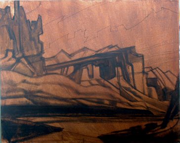
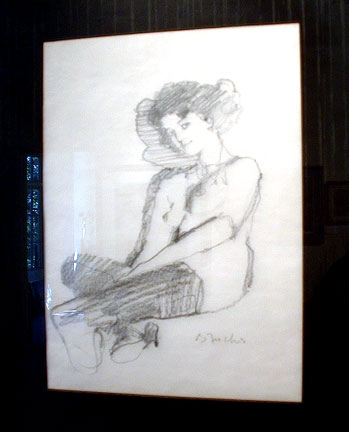
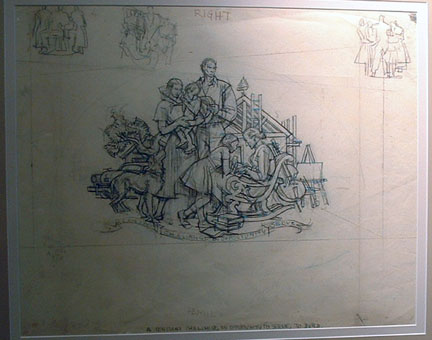
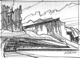
Here are the stages of development, beginning with the final pencil concept.

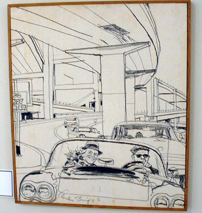
The next stage was to project my pencil onto the working surface. I used a stretched canvas as my base.
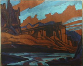
After completing the underdrawing, I applied a thin, semi-transparent layer of burnt sienna Acrylic, directly over the drawing.
You can see, at this stage, that i'm thinking about a change to the train image. I didn't care to be looking at the back end of the train on the mid-left side, so I just changed it to be coming directly into frame from the left side.
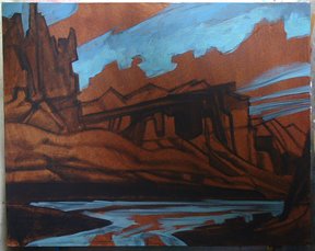
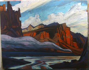
The next step was to begin painting in the sky area, by scumbling in some fairly thin acrylic paint. At this stage I am not trying to be too careful, or trying to complete any one part of the picture.

From here on in, it's just a matter of letting the painting "talk" to me about value and hue.
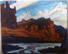
I decided to add a river in the extreme foreground as a way of directing the viewers' eye INTO THE PICTURE FRAME.
In general, I like to work from the back towards the front of the picture plane. You can see that unfolding in the third and fourth pics. plus I have begun to fill in all the clouds to semi-complete the upper sky area by this stage.

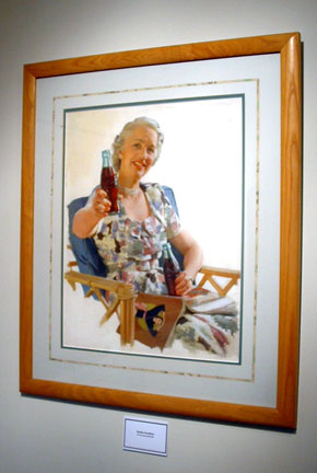
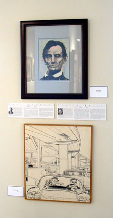
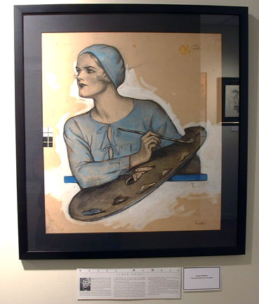
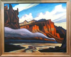
The final images shown here show the various stages of finished development of the work, leading up to the framed artwork.
I hope you learned a few things in looking over this step-by-step process. Let me know what you think with your comments.
I'll be posting other works on a weekly basis, on this BlogSpot.

Monday, September 11, 2006

WHAT YOU SEE.... ISN'T ALWAYS WHAT YOU GET !!!!!


Here is the final Prototype (in 3_D) of the Winter Brew tapper handle that... somehow.... came out of the designs, both pencils and color comps that i posted on the last Blog entry......... GO FIGURE !!

Tapper handle concepts - Final comps


The final stage of development on the Tapper Handle Project was to create a few color "comp" versions of some of the pencils that the client preferred... over others. Based on the Snowman direction, here are some examples of what was chosen for consideration.
The first color version of the snowman was deemed a little too "cute or bright" for the intended target market. So I toned down the color and limited the pallette.

SOME RECENT CONCEPT PROJECTS


I have been involved recently with developing pencil concepts for many of my clients. I have found that these recent projects have been a great source of renewed interest in my drawing skills. As you will see, in this Blog entry, what you are given, by the client, at the start of the project, and what you finally arrive at, near the end.... aren't always the same.
The first example shown here was a project for Anheuser-Busch to create a Tapper Handle Design (3-D) for a new "Winter Brew" with a Jack Frost Image direction. My first few emails were more of an exploratory nature, to see if I was on the same page with the client.
There were a total of three pages of rough pencil ideas sent to the client.
The next stage of developement was to push a little farther in another image direction (ie:Super hero, etc.) and see if the Brand Managers liked this approach.

Sunday, September 10, 2006


The Bill Vann Art Signature Collection


This blog has been created to make available to all interested collectors, many of the original paintings and drawings that i have been collecting for many years. I have finally run out of physical space, both wall... and storage, to house all this incredible artwork. Plus, my wife has been after me for years to simply downsize the collection.
It may take me a while to organize the posting of these images for all to see, but i'm determined to do so in the next few days.
I also have secondary plans to use this Blog as a tool to show a different marketing approach to the kind of Illustration projects I intend to obtain from here on in...